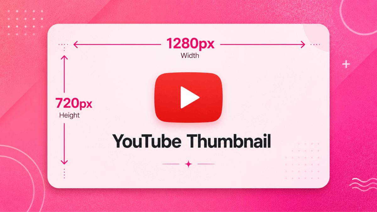
Direct answer: the thumbnail and the title work as one unit, not two. A viewer sees both in the same instant and decides. YouTube recommends a thumbnail of 3840x2160 pixels at 16:9, and states that half of all channels and videos have a click-through rate between 2 and 10 per cent. CTR is not a target in itself: if it rises while watch time falls, you promised something the video did not deliver. The working rule is a thumbnail that reads on a small screen, a title that completes the thumbnail instead of repeating it, and measurement through Test and compare rather than guesswork.
- Recommended spec: 3840x2160 pixels, 16:9, minimum width 640 pixels.
- Thumbnail and title are one pair: each should say what the other does not.
- CTR: YouTube says half of channels and videos sit between 2 and 10 per cent. It is not a number to chase.
- CTR falls naturally as impressions grow, and that is expansion rather than a fault.
- Test and compare measures up to three thumbnails on real performance instead of opinion.
The official specification
Everything in this table comes from the "Add custom thumbnails on YouTube" page as it reads today.
| Item | Regular video | Shorts |
|---|---|---|
| Recommended resolution | 3840 x 2160 pixels | 2160 x 3840 pixels |
| Minimum | 640 pixels wide | 640 pixels tall |
| Aspect ratio | 16:9 | 9:16 |
| Format | JPG or PNG | |
| File size from mobile | 2 MB for video thumbnails, 10 MB for podcasts | |
| File size from desktop | 50 MB for video, Shorts and podcast thumbnails | |
| Podcast playlists | 1:1 instead of 16:9 | |
Three details most guides skip:
- The page asks for an image "as large as possible" because it doubles as the preview image in the embedded player. That is why 3840 x 2160 is the recommendation rather than an overspecification.
- Vertical videos with a 16:9 custom thumbnail "will be replaced by an auto-generated 4:5 thumbnail on the home, explore, and subscription pages", while your custom image still appears on the watch feed, watch history and non-mobile platforms.
- YouTube notes that thumbnail changes may take time to appear across the platform after you save.
Who can upload a custom thumbnail
The official wording is that you can pick from auto-generated suggestions "or upload your own if your account is verified". Verification here means phone verification of the account, and the verification page lists "Add custom thumbnails" among the things it unlocks, alongside uploads longer than 15 minutes, live streaming and copyright appeals. It is not the verification badge given to large channels; those are two different things. The practical limits on the feature:
- Custom Shorts thumbnails can only be added "in YouTube Studio on a computer", and the account still has to be verified.
- There is a daily cap. The page describes a limit on how many custom thumbnails a channel can upload each day, with a "Daily custom thumbnail limit reached" error and a 24-hour wait. Limits "may vary by country/region or channel history", and both copyright strikes and Community Guidelines strikes affect them.
- Selective switching off: YouTube says it "may turn off custom thumbnails for certain search results when they're considered inappropriate for viewers".
- Generation inside Studio: besides the "Get suggestions" button, Ask Studio can generate thumbnail suggestions by analysing the video's transcript and themes, and it accepts follow-up prompts such as making the text larger.
The rest of your channel's visual identity, the avatar, the banner and overall consistency, is covered in the YouTube channel branding guide.
Design guidance from YouTube's own pages
The "Thumbnail and title tips" page carries the only official design guidance, and it reads more like legibility rules than art direction:
- Start from who the video targets. The page distinguishes content aimed at subscribers, where familiar elements work, from content aimed at casual viewers, where "actions and emotions that are more universally relatable, like a shocked face" work better.
- The rule of thirds. "You can apply the rule of thirds to create interesting images", then overlay your branding and descriptive text.
- A readable font. Verbatim: "If you add text, make sure to use a font that's easy to read."
- Do not overcomplicate. "Dynamic use of color and composition can help catch the eye, but too much can overwhelm it."
- Thumbnails show up differently across devices, which is why the page asks for the image to be as large as possible.
- Taste moves. "Thumbnail styles can shift over time", and YouTube recommends experimenting with updating older thumbnails to appeal to new viewers.
- Shoot stills as you film. An explicit official recommendation: take pictures during the shoot so you have several options at upload time.
What the page does not say is equally useful: there is no official word count, no preferred colour, and no success rate for a human face against a product shot. Any number of that kind is a third-party estimate.
Text inside the image
The only official rule is a font that is easy to read. Everything below is practical interpretation, and it holds up because a thumbnail is viewed at a few centimetres wide:
- Three words is a working ceiling. A full sentence disappears on a phone.
- Heavy weights, not thin ones. Thin and decorative faces lose their detail first at small sizes.
- High contrast with a separating edge. Light type on a dark area or the reverse, with a subtle shadow or outline so the letters detach from the photo behind them.
- Do not repeat the title. The image and the title appear together, so repeating wastes half the space. Writing the other half is covered in the guide to writing YouTube titles.
- Keep the edges clear. The duration badge sits in a corner and some surfaces add elements over the image, so leave breathing room around the frame.
- Test by shrinking. Scale the design down to thumb width before saving. If the word is unreadable there, nobody reads it.
Writing the title that pairs with it
A title is not a caption for the thumbnail. It is the second half of the promise. The rule that saves the most time: if the title says the same thing the image already says, one of the two has been wasted.
The four official rules
The "Thumbnail and title tips" page is the direct official reference for writing titles, and it is shorter than most people expect:
- Be accurate: "Make sure your title accurately represents the video. If not, viewers may stop watching, which can impact discoverability." That single sentence links honesty to performance, and it is the most important line on the page.
- Be succinct: "Viewers may only see part of your title. So aim to keep it short and put the most important words near the beginning."
- Episode numbers and branding at the end: "Save episode numbers and branding for the end." Subscribers already know your channel, and a new viewer reads the first few words only.
- Limit ALL CAPS and emoji: "Use them carefully, to emphasize emotion or special elements in the video." The instruction is restraint, not prohibition.
What the page does not say matters just as much: no preferred formula, no word count, no list of power words. The search and discovery tips page states plainly that the system "has no opinion about what type of video you make, and doesn't favor any particular format", ranking on performance and personalization instead. Where titles sit inside the whole discovery system is covered in the the YouTube algorithm guide.
Searchable titles versus intriguing titles
YouTube names two types and asks you to choose between them based on "who may watch your video and where they may find it":
- Searchable titles "clearly outline what to expect so you can easily reach viewers searching for similar content". They fit tutorials, walkthroughs, reviews and troubleshooting, and they carry the real query you picked during keyword research.
- Intriguing titles "spark curiosity and appeal to viewers who may not be looking for topic-specific content". They fit stories, experiments and entertainment that arrives from Home and Suggested.
The practical decision: if the video answers a question people type, write the question. If the video is an experience nobody searches for by name, curiosity is your only door. You can combine both in one title when the content genuinely serves both, as long as the curious half does not promise something the video never delivers.
Length and truncation
There is no official number. The official page says "viewers may only see part of your title" and stops at brevity plus front-loading. The figures that circulate in blog posts, tools and even in Google's AI Overview for this query (50 to 60 characters, under 60 to 70 characters) do not come from YouTube. They are third-party estimates, and they vary by surface and device.
What can be said with confidence:
- The title field in YouTube Studio stops at 100 characters. That is an input limit, not a recommendation.
- Truncation happens at different points in search results, on Home, and in the suggested list on mobile. No single number covers them all.
- The one reliable check is to look: publish or preview, then open YouTube on your phone and see where the title actually cuts.
- Because truncation always eats the end of the string, put the promise at the front and leave secondary detail and branding for the end, exactly as the official page recommends.
Before and after examples
The examples are illustrative. The principle in the last column is the part to keep.
| Weak title | Clearer title | Why |
|---|---|---|
| Ep. 14 | The Camera Channel | Gear talk | Beginner camera buying: three checks before you pay (Ep. 14) | Episode number and branding move to the end, the subject moves to the front. |
| You won't believe what happened in this video | I filmed everything on a phone for a week: what worked, what failed | Curiosity survives, but the title now describes what is actually in the video. |
| Complete comprehensive detailed guide to everything about editing | Editing your first video: from import to export | Shorter, no filler, and a clear promise with a defined scope. |
| Best free editing software 2026 best editing programs free | Free desktop editing: three programs compared | Repeating the phrase adds no relevance; describing the content does. |
| How to get more views fast | Why views stall after the first two hours, and how to read the cause | A promise you can keep instead of a result nobody controls. |
Titles and thumbnails work as a pair
YouTube treats the two as one unit: "Great titles and thumbnails serve an important purpose beyond getting viewers to click. They help a viewer understand what the video is about so that they don't waste their time clicking on the wrong videos." Two working rules follow:
- Do not print the same words twice. If the thumbnail carries three words, the title should add the missing half, not repeat it.
- The image is read first, the title confirms. On most surfaces the thumbnail registers before the text, so let the title answer the question the image raised.
Designing the image itself, its official specification and its policies are covered in the YouTube thumbnail guide. Click-through rate as a metric, when to read it and when it means nothing, belongs to the impressions and CTR guide. One line is enough here: YouTube says videos whose titles and thumbnails overpromise tend to have low average view duration and are therefore less likely to be recommended.
Title formats and what YouTube does not say about them
Numbered lists, brackets, years, and "I tried X for 30 days" all recur on YouTube, and creators ask whether they help. No official page evaluates any of them, so here is the honest position and how to test it yourself:
- Numbers set a scope the viewer can judge in one glance. They work when the number is real and the video delivers exactly that many items.
- Brackets and parentheses are useful for the secondary detail that the official rule wants at the end: the episode number, the format, the year.
- A year in the title is a promise of freshness that expires. Use it when the content is genuinely time-bound, and expect to revisit it.
- Curiosity gaps are legitimate when the video closes the gap early. Withholding the answer to the end is the pattern YouTube's clickbait wording describes.
All four are testable inside Studio with a three-way Test and compare, and that result, measured on your own audience by watch time, outranks any general claim about title formulas.
Click-through rate: what it actually means
Once a video is live, CTR is the only way to measure packaging with numbers. But it is a diagnostic, not a goal, and reading it wrongly leads to worse decisions than not reading it at all.
What impressions and impressions CTR actually measure
Impressions: how many times your thumbnails were shown to viewers on YouTube through registered impressions. According to YouTube's help page, an impression is counted if the thumbnail is shown for more than one second and at least 50% of it is visible. Impressions are counted on YouTube on computers, TVs, consoles and mobile apps, in YouTube Search, on the homepage, in feeds (subscriptions, trending, history, Watch Later), in "Up Next" beside the player, and in playlists. They are not counted on external websites and apps, inside the player itself (cards, end screens), in email or notifications, in background tabs, or when the thumbnail is under 50% visible or shown for under one second.
Impressions click-through rate: in YouTube's words, "how often viewers watched a video after seeing a registered impression on YouTube". That makes it a subset of your total views, not all of them: views that arrive from external sites or from end screens are outside the calculation. Two situations follow from this and confuse a lot of creators:
- More views than impressions: happens when a large share of traffic comes from outside YouTube, because not every view starts from a registered thumbnail impression.
- The rate does not match your own arithmetic: CTR is based only on views that came from counted impressions, so total views divided by impressions gives a different number.
Where to read the report in YouTube Studio
According to the "Check your YouTube impressions and watch time" page (read 22 August 2026): sign in to YouTube Studio, open Analytics, then the Content tab. With the "All" filter selected you get the "Impressions and how they led to watch time" report: a funnel that starts with impressions, then the views they produced, then the watch time those views produced, and it also shows what share of your impressions came from YouTube recommending your videos. At the single-video level the same metrics sit in the Reach tab. The key metrics card is available within a few hours of publishing and can differ slightly from the detailed report because it is refreshed more often.
That is all you need from Studio for this page. The rest of the reports (traffic sources, audience, engagement) belong to the YouTube Analytics guide.
What YouTube says about a "good" CTR
The only official sentence, on the impressions and click-through-rate FAQ page as read on 22 August 2026: "Half of all channels and videos on YouTube have an impressions CTR that can range between 2% and 10%." The same page attaches important qualifiers:
- New videos or channels (less than a week old, for instance) or videos with fewer than 100 views can see an even wider range.
- A video that gets a lot of impressions (such as one that appears on the Home page) will naturally have a lower CTR.
- A video whose impressions mostly come from your channel page may have a higher rate.
- YouTube's own conclusion: compare CTRs between your videos over the long term, keeping traffic sources in mind, rather than against an outside number.
In practice: this is a descriptive statement about the distribution of channels, not a target. Any article or tool offering a more precise "industry average" is estimating from its own data, not restating YouTube.
Why CTR falls as impressions grow
The explanation is in the first question on YouTube's own FAQ page: YouTube's systems rank each video against every other video a viewer might watch, not against the rest of your channel. Videos with fewer impressions and views commonly have higher CTR and average view duration because they are seen by a narrower, more loyal audience. When a video does well and starts being shown to a wider audience that does not know your channel, the probability of a click drops, so CTR drops even as views climb.
So read the two numbers together: rising impressions with a gradually falling CTR is usually a sign of expansion, not failure. Few impressions with a high CTR may simply mean the video has not yet left your subscriber circle. How YouTube distributes impressions in the first place, and which signals it names itself (average view duration, average percentage viewed, likes, satisfaction surveys), is covered in the YouTube algorithm and recommendations explainer.
Diagnosis order: packaging, audience or surface
Before changing anything, work out which of the following symptoms you actually have. The table is editorial interpretation built on what YouTube's pages say; it is not an official rule:
| Symptom in Analytics | Likely cause | Next step |
|---|---|---|
| Low CTR on every surface (Search, Home, Suggested) with normal view duration | Packaging: the thumbnail or title does not make the payoff clear | See the YouTube thumbnail design guide and the YouTube title writing guide |
| High CTR with low average view duration and fewer impressions than expected | This is YouTube's official description of a clickbait thumbnail or title | Re-package so the promise matches what is in the video |
| CTR falls while impressions rise | Normal expansion to a new audience (Home surface) | No action; watch view duration |
| Good CTR and view duration but few impressions | External factors YouTube names: topic interest, competition, seasonality | Review traffic sources and the topics of upcoming videos |
| More views than impressions | External traffic (embeds, links, apps) | Not a measurement problem; separate external traffic when comparing |
When not to chase CTR
YouTube is explicit: avoid trying to increase CTR with clickbait thumbnails or titles. A video is recommended when it is relevant to the viewer and when its average view duration shows viewers found it interesting; clickbait videos tend to have low average view duration and are therefore less likely to be recommended. Any gain in clicks is paid back later in impressions.
There is also a case that has nothing to do with packaging: if a video is not suitable for a broad audience under the Community Guidelines, that alone can limit its impressions, and if it is not suitable for most advertisers it may get limited or no ads. Changing the thumbnail fixes none of that. And note that the page itself closes by saying its suggestions are based on aggregate success rates and do not promise any particular outcome for your case.
The wider picture of how videos get found in search and recommendations is in the YouTube algorithm guide.
Testing thumbnails inside Studio
Test and compare works on thumbnails the same way it works on titles: "up to 3 different titles and thumbnails", with the option that has "the highest watch time" shown to everyone at the end. The thumbnail-specific rules:
- Desktop only through YouTube Studio, with advanced features enabled.
- Not available for Shorts, Scheduled Lives or Premieres while they run. Live archives are eligible.
- Not available for videos that are made for kids, for mature audiences, or private.
- A resolution rule worth knowing: "If the resolution of any thumbnail is lower than 720p (1280 x 720), all experiment thumbnails will be downscaled to 480p." One weak file degrades every option in the test.
- Editing the thumbnail during a test stops it, and results appear in the Reach tab as Winner, Performed Same, or Inconclusive.
- YouTube recommends making the options genuinely different, because near-identical thumbnails stretch the test without producing a winner.
If the feature is not available to you, the fallback is to swap one video's thumbnail and watch performance over several weeks, remembering that this is not a concurrent test and that traffic sources drift over time. Reading the numbers afterwards is covered in the YouTube Analytics guide, and the CTR metric itself belongs to the impressions and CTR guide. One line is enough here: YouTube says clickbait thumbnails tend to produce high CTR with low average view duration, which makes a video less likely to be recommended, not more.
The thumbnails policy
Thumbnails have their own policy page, and the consequences are not all the same:
- Not allowed: pornographic imagery, sexual acts, nudity, "violent imagery that intends to shock or disgust", blood and gore, vulgar or lewd language, and "a thumbnail that misleads viewers to think they're about to view something that's not in the video". The page notes the list is not complete.
- Removal or age restriction with no strike: when an image is not appropriate for all audiences but does not break the Community Guidelines, "we may age-restrict the video, or we may remove the thumbnail, but we don't issue a strike on your channel", and you can upload a replacement.
- Violations that do carry a strike: if the thumbnail breaks another policy it is removed and a strike may follow. A first violation is usually a warning with no penalty, with a policy training that lets the warning expire after 90 days; breaking the same policy inside that window can stop the warning expiring and turn it into a strike.
- The severe end: a pornographic thumbnail may end the channel, and three strikes in 90 days may do the same.
- Losing the feature: the thumbnails page states that repeat offenses "may lead to the removal of your custom thumbnail privileges for 30 days or even account termination".
- Ads read the image: the advertiser-friendly guidelines state that "our policies apply to all portions of your content (video, Short, or live stream, thumbnail, title, description, and tags)", and they place profanity in a thumbnail among the things that limit or remove ad earnings.
If a thumbnail is removed or a strike is issued and you believe the image does not break the guidelines, the official page allows an appeal, and says that if the appeal is approved and you have not already replaced the image, "we may restore it".
Common mistakes
- Long text inside the image. Most viewing is on a phone, and three words is the practical ceiling.
- A title that repeats the thumbnail. Half the promise space is thrown away.
- Chasing a high CTR on its own. A high rate with low watch time means a promise that was not kept.
- Comparing your CTR to another channel. The rate depends on where the impressions came from, so cross-channel comparison means nothing.
- Swapping the thumbnail daily. Without a settled period you cannot tell what changed the result, which is exactly what Test and compare handles properly.
Frequently asked questions
What is the correct YouTube thumbnail size?
YouTube recommends 3840x2160 pixels at 16:9, with a minimum width of 640 pixels, as a JPG, PNG or GIF within the file-size limit stated on the thumbnails page.
What is a good CTR on YouTube?
YouTube states that half of all channels and videos fall between 2 and 10 per cent. There is no absolute good number, because the rate shifts with the impression source, the age of the video and the size of the audience.
Why does my CTR drop as views go up?
Because YouTube is showing the video to a wider, less closely matched audience. A falling rate at that point is a sign of expansion rather than a fault.
Can I upload a custom thumbnail on any video?
Custom thumbnails require an account with advanced features enabled through verification. Before that, YouTube selects an automatic frame from the video.
Does changing the thumbnail change my ranking?
The image does not change search ranking directly, but it changes how many people click, and engagement is one of the ranking elements YouTube names.
Practical summary
Design for the small screen first: one clear face or object, high contrast, three words at most. Write the title after the image rather than before, and let each carry half of the promise. Publish, then leave the video alone for a week before judging it, and read CTR alongside watch time rather than on its own. When you do want to change the image, use Test and compare instead of manual swapping, because it is the only method that gives you a reason rather than an impression.
Official sources
- Add custom thumbnails on YouTube: resolutions, ratios and size limits, the verification requirement, the daily limit, and the in-page thumbnail policies (read 22 August 2026).
- Thumbnails policy: what may not be posted, age restriction and removal without a strike, warnings, policy training and 90 days, and termination cases (read 22 August 2026).
- Thumbnail & title tips: rule of thirds, readable fonts, avoiding complexity, and refreshing older thumbnails (read 22 August 2026).
- A/B test titles & thumbnails: three thumbnails, the watch-time winner, eligibility, and the 720p downscaling rule (read 22 August 2026).
- Impressions & click-through-rate FAQs: clickbait thumbnails and low average view duration (read 22 August 2026).
- Advertiser-friendly content guidelines: policies applying to the thumbnail, title, description and tags (read 22 August 2026).
- Verify your YouTube account: phone verification unlocks custom thumbnails (read 22 August 2026).
- Search & discovery tips: no favoured format, ranking on performance and personalization (read 22 August 2026).
- Find playlists & videos using hashtags: three hashtags by the title, no spaces, misleading hashtags (read 22 August 2026).
- Explore the Inspiration tab: AI title suggestions, desktop only and English only (read 22 August 2026).
- Check your YouTube impressions and watch time (YouTube Help): the one-second and 50%-visible rule, where impressions are and are not counted, and the "Impressions and how they led to watch time" report (read 22 August 2026).
- Understand your YouTube video reach (YouTube Help): the Reach tab, definitions of impressions and impressions click-through-rate, "Stayed to watch" for Shorts, and traffic-source types (read 22 August 2026).